The interplay between a person and the environment they are in is an absorbing concept; how we organise, identify and interpret information through our senses and why we attach meaning to some spaces more than others.
We explore the role our sight plays in how we experience and respond to spaces. We explore the visual design cues in a space, looking at how we receive, understand and connect to an environment through what we see.
To see is to experience
Our five senses work in close collaboration, but sight presents us with the greatest range of sensory cues. Take a moment to become present in the space you are in now and note all the different visual cues; color, light, shadow, shape and movement. Interestingly, movement is considered a hidden visual sense – that feeling of momentum experienced when eyeing elements like patterns and lines.
Let’s dive beneath the surface of three major visual cues: color, lighting and layout.
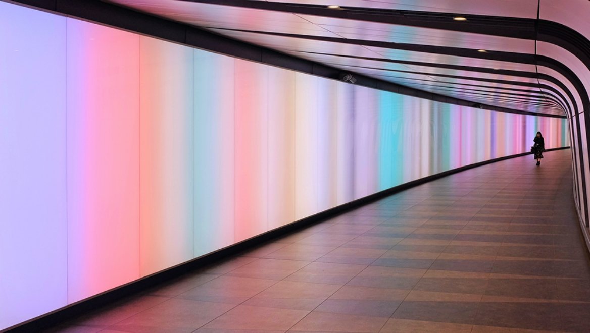
1. Color
Pablo Picasso once commented, “colors, like features, follow the changes of the emotions.” Through his painting, he powerfully conveys and evokes mood through color. See works in his ‘blue period’, where monochrome shades of blue and green emanate from the canvas, imparting a sadness that viewers understand – perhaps on both a conscious and subconscious level.
Color association feels universal, but the connection we all feel towards different colors is deeply personal and rooted in our individual experiences, preferences and culture. There is great diversity in how colors are perceived between countries and continents – and what they symbolise.
The spectrum of color association across the world:
- Red; love, passion, danger, good luck
- Blue; serenity, inspiration, health, sadness
- Yellow; joy, cowardice, fear, youth
- Green; nature, healing, fertility, greed
- Pink; romance, happiness, playfulness, politeness
- White; perfection, purity, cleanliness, innocence, mourning
Within spaces, color has the power to influence and create specific mood and feeling. While its use is complex and must be carefully considered, it offers a unique experience to all who see it.
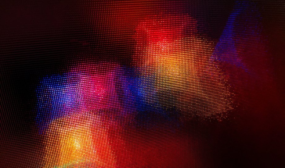
2. Lighting
Light has the power to transform an environment into an extraordinary experience. Responding to light’s visual cues is different to how we perceive color; light is hardwired into our innate selves. It has the power to immediately set a desired mood in a space, create feeling and provide visual focal points.
In your mind’s eye, step into a space lit with soft yellow and orange tones. Working hand in hand with the warm colors, the soft lighting creates a more relaxed atmosphere that encourages intimacy, almost like being under candlelight. To our visual sense, yellow and orange light is connected with sunrise and sunset – the most tranquil moments of the day, fostering feelings of stillness and calm.
Come out of the yellow room and step into a newly imagined room. This time it is lit by hard, bright light. To our visual sense, the hard lighting replicates daylight and, especially when paired with bright blue tones, creates cooler environments that stimulate those within it, encouraging vigilance and focus. Within the imagined space, you may be feeling attentive, prepared and alert – as nature intended.
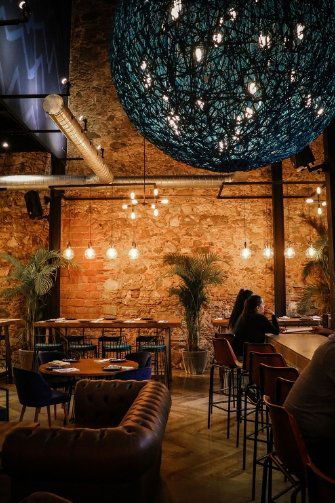
3. Layout
Visually, layout holds the fundamental keys to both harmony and disruption. Seeing different architectural cues, like the size and spaciousness of a space, influences mood and emotional response. Layout connects us and reinforces desired interactions and feeling, consciously and unconsciously influencing factors like how safe we feel and how connected we feel to those around us.
Ceiling height in particular carries emotional impact; the perception of feeling restricted or free within a space. Light, aesthetic fixtures and color all offer unparalleled ways to visually adjust the impact of ceiling height. A low-ceilinged space with a restricted feel can transform into an intimate environment where different zones can be created when paired with a dark ceiling color, high wall finishes and soft feature pendant lighting.
Seeing natural features like plants and flowers also produces emotional response within a space; our collective affinity with nature is equally hardwired as lighting, creating and promoting a sense of calm and composure within spaces of all different purposes.
Sensorial balance
While sight is our primary sense, the overall experience of a space requires sensorial balance that communicates the right sensory messages. Too much color, too much light or an uneasy layout can feel overwhelming, distracting and create an experience that’s not fit for the space’s intended purpose, leaving a negative imprint on the user.
What we see must be considered alongside what we hear, taste, smell and touch.